So.
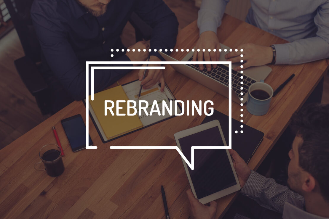
Your company wants to rebrand.
New logo. New vibe. New everything.
Great idea—unless it’s not. Because rebranding can either make you the Beyoncé of your industry… or the Gap of 2010. (Spoiler: Gap changed their logo and people freaked out so hard, they switched it back in six days. Not even milk goes bad that fast.)
Let’s talk about when rebranding works—and when it backfires like a sad trumpet solo.
Why Rebrand? (Besides Just Being Bored)
Contrary to what some execs think, rebranding isn’t about “freshening things up” like your living room in spring. It’s a strategic move (or at least it should be).
Here’s why companies really rebrand:
- They merged, got acquired, or just realized their logo still uses WordArt.
- Their audience changed—and they forgot to grow with them.
- They want to leave a past mistake behind (looking at you, shady customer service years).
- They’ve got a shiny new mission and their old brand screams “2008 startup with a ping-pong table.”
Done right, rebranding can help you stand out, attract the right people, and finally stop explaining that no, you’re not that other company with the similar name and worse reviews.
The Glow-Up That Actually Works
A successful rebrand isn’t just a new logo. It’s a full identity refresh with meaning behind it. And, spoiler alert: it’s a ton of work.
Want people to buy in? Then:
- Make sure your team actually understands the change. (Not just Karen in HR.)
- Be real. Customers smell inauthenticity like old fish in a hot car.
- Test it. If your audience hates the new logo, maybe don’t print 10,000 tote bags just yet.
- Get your operations in sync. Every product, label, sign, and pixel has to match the new look. That’s where tools like Licensing Software save lives (and sanity). They help ensure every packaging update, design file, and asset is approved and aligned with the new Style Guide—no rogue logos or outdated fonts sneaking through the cracks.
Because nothing kills a sleek rebrand like a warehouse full of old boxes that still say “We’re hip and innovative!” in Comic Sans.
Rebranding Fails: A Horror Story Collection (Hide Your Logos)
Grab your flashlight and a blanket—because these rebranding fails will keep brand managers up at night.
1. Gap (2010): The Six-Day Panic
Gap rolled out a new logo that looked like it was designed in 5 minutes with free clipart. The internet exploded. People hated it. And just six days later, the company reversed the change. Honestly, we’ve all made bad decisions in a week—Gap just did it on a global stage.
2. Tropicana (2009): Who Took My Juice?
Tropicana swapped its iconic orange-with-a-straw for a bland, modern look. The result? Confused shoppers and a 20% drop in sales. The brand quickly backpedaled, proving that minimalism is not always the answer—especially when it makes your product unrecognizable in the fridge.
3. Twitter Becomes X (2023): From Tweets to What, Exactly?
Twitter decided to rebrand as X, ditching one of the most iconic brand names and visuals of the 21st century. Users were baffled. The platform lost massive brand equity overnight, and the rebrand still feels like someone deleted the soul of the product and replaced it with a placeholder.
4. Cracker Barrel (2025): Bye-Bye Tradition
This one hit differently. Cracker Barrel removed key identity elements like “Uncle Herschel” and the phrase “Old Country Store.” The backlash was immediate—especially from its conservative core audience. When public figures joined the outrage, the brand had to backtrack, proving once again: don’t mess with nostalgia unless you really know what you’re doing.
5. Kraft (2009): Generic and Forgettable
Kraft introduced a new logo that looked like… well, nothing. It was generic, lifeless, and stripped of the brand’s familiar boldness. Customers didn’t get it, and six months later, neither did Kraft—it quietly rolled back the changes and never spoke of it again. Like a bad haircut.
6. Falabella (2021): Orange You… Someone Else?
Latin American retail giant Falabella ditched its iconic green in favor of orange—and customers immediately compared it to a competitor. The emotional and visual connection with the brand was lost, and confusion reigned. Lesson? Don’t sacrifice your brand’s identity for a trendy color swap.
7. Jaguar (2024): Luxury Gets… Boring?
Jaguar tried to reposition as a modern luxury brand, but the new visual identity felt too generic. Critics said the typeface looked more “budget EV” than “refined performance.” Sometimes, less is just… less.
8. Burberry (2018): Minimalism Overload
Out went the knight, the serif, the heritage. In came a plain sans-serif logo that looked like it belonged on a startup’s pitch deck. The backlash was swift—because when you’re a luxury brand, your identity is your history.
Moral of the story? Don’t erase your brand’s soul. People connect with it—even if it’s a weird old man in a rocking chair.
Thinking About Rebranding?
Cool. Just promise us three things:
- You’re not doing it because “it’s been a while.”
- You’ll tell your audience why it matters.
- You won’t remove everything that made people love you in the first place.
Rebranding is like dating after a breakup: you want to look better, feel better, and maybe upgrade your font—but you’re still you. Or at least, you should be.


